Are Muddy Colours really a bad thing
 Kerri Dixon
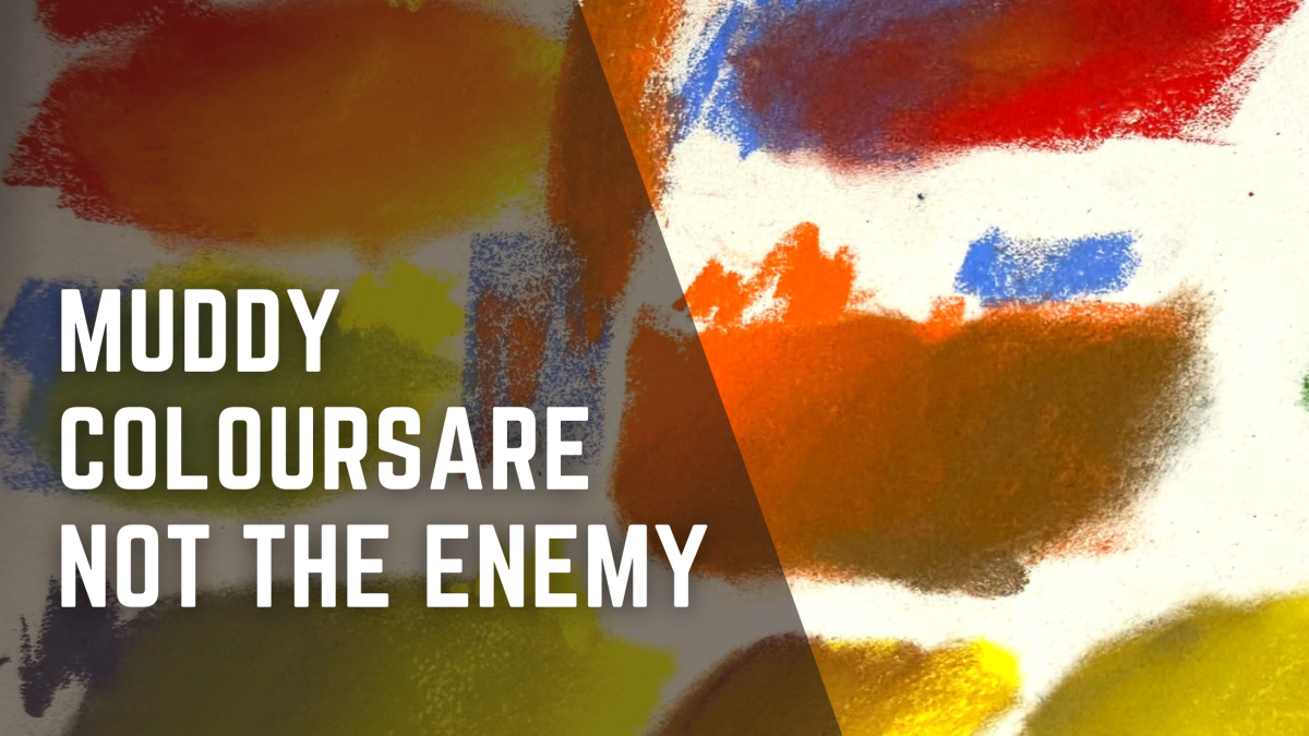
Learn why muddy colours aren't always bad and how complementary colours, neutrals and simple colour theory can improve your pastel paintings.
Muddy Colours Aren’t the Enemy
Have you ever been happily working away on a painting, adding a little bit of this colour and a little bit of that, only to suddenly realise everything is starting to look a bit… muddy?
One of my students recently asked if I could talk about muddy colours — how to avoid them, whether muddy colours are always a bad thing, and how you know which colours to mix to get a particular colour.
She also said something I think a lot of artists can relate to:
“I know there is a colour wheel out there, I just don't understand it.”
Colour theory can sound far more complicated than it needs to be. Primary colours, secondary colours, complementary colours, analogous colours… before long you feel like you need an art degree just to choose a green.
But because I work mainly in soft pastel, I think there's another important point we need to make.
We don't really mix colour in pastel in quite the same way we mix paint.
Rather than trying to memorise colour recipes, I think it's much more useful to understand a few basic colour relationships and use them to help us choose, layer and adjust our colours.
And that starts with understanding that muddy colours aren't necessarily the enemy.
What is a muddy colour anyway?
When we describe a colour as muddy, we're usually talking about a colour that has lost its brightness or intensity.
Maybe you started with a beautiful fresh orange and after layering several colours over it, it became a dull brown.
Or your lovely green gradually turned into a greyish olive.
That's usually when we think:
Oh no. I've made mud.
But here's the thing.
Brown, grey, olive, dusty purple, muted orange and all those slightly dirty-looking colours aren't bad colours.
In fact, nature is absolutely full of them.
Look closely at animal fur, tree bark, rocks, sand, feathers, soil and shadows and you'll find an enormous range of muted colours.
The problem isn't really muddy colour.
It's muddy colour when you didn't want it.
There's a big difference between a colour being muted on purpose and becoming muddy by accident.
Pastel isn't paint
This is where traditional
colour theory can sometimes confuse pastel artists.
If I were mixing paint and I had an orange that was too bright, I might mix a tiny amount of blue into it to neutralise the orange and create a more muted colour.
But with pastel, I probably wouldn't do that.
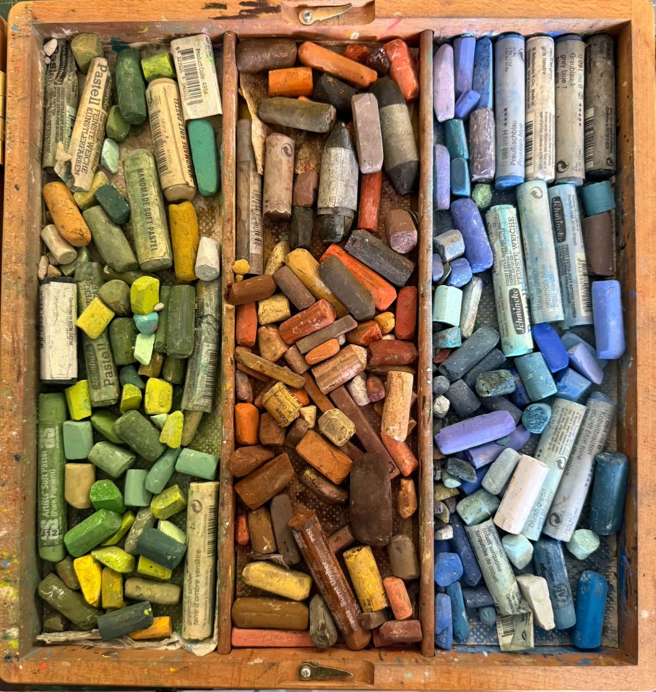
I've got a box full of pastels containing all sorts of oranges — bright oranges, warm oranges, cooler oranges, earthy oranges, brownish oranges and everything in between.
So my first question isn't necessarily:
“What colours do I need to mix?”
It's more likely to be:
“Do I already have a pastel that's closer to the colour I can see?”
That's one of the wonderful things about pastel. We have access to an enormous range of ready-made colours and values.
Understanding colour theory is still incredibly useful, though, because it helps us understand which pastel to reach for.
The colour wheel doesn't have to be complicated
You don't need to memorise the entire colour wheel to make it useful.
Let's start with the basics.
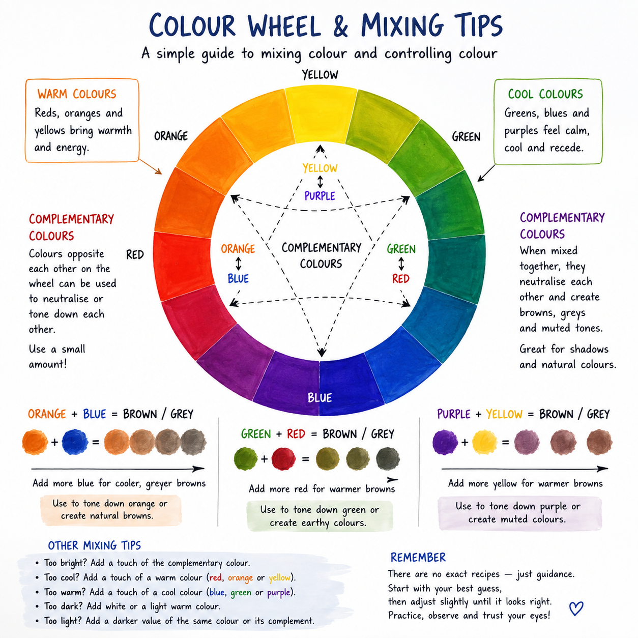
Our three traditional primary colours are:
Red, yellow and blue.
From those we get our secondary colours:
Red + Yellow = Orange
Yellow + Blue = Green
Blue + Red = Purple
Now here's the relationship I think is particularly useful.
Colours sitting opposite each other on the colour wheel are called complementary colours.
The main complementary pairs are:
Red and Green
Blue and Orange
Yellow and Purple
When complementary colours are mixed together in paint, they begin to neutralise each other.
Orange becomes less orange.
Green becomes less green.
Purple becomes less purple.
Depending on the colours and proportions used, we can create beautiful browns, greys and other muted colours.
But how does that help us with pastel?
Think of complementary colours as a volume control
I like to think of complementary colours as a volume control.
Imagine you've chosen an orange pastel for some animal fur, but when you put it onto your painting it practically glows in the dark.
It's too saturated.
If you understand that blue is opposite orange on the colour wheel, you know you're looking for something less intensely orange and perhaps a little cooler.
You might simply reach into your pastel box and choose a cooler, more muted orange.
You haven't physically mixed orange and blue, but your understanding of colour theory has helped you make a better colour choice.
If you're working with a smaller pastel collection and don't have the exact colour you need, that's when layering becomes useful.
A light layer of blue over orange can visually neutralise it. We're not necessarily mixing the pigments together as we would with wet paint. Instead, particles of colour can sit over and beside one another and our eyes do some of the mixing.
That's one of the beautiful things about pastel.
Complementary colours aren't just about contrast
We often hear that complementary colours create contrast.
And they do.
But I think there's much more to them than that.
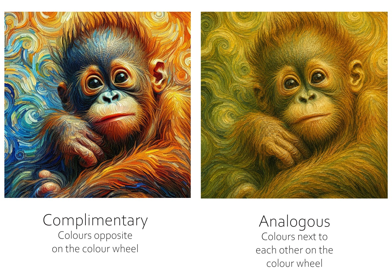
I recently looked at a painting of a baby orangutan that demonstrates this beautifully.
The orangutan is surrounded by these gorgeous fiery oranges, golds and warm browns, but running through the painting are strong blues and blue-greens.
Orange and blue are complementary colours.
At first, the most obvious thing you notice is the contrast.
The cool blue makes the orange fur appear even warmer, while the warm orange makes the blues appear cooler and more vibrant.
But when you look more closely, there's something much more interesting happening.
The painting isn't simply:
Bright Blue + Bright Orange
There are all these wonderful colours sitting between those two extremes.
There are blue-greys, greyed blues, ochres, muted oranges, warm browns, cool browns and all sorts of beautiful neutrals.
And those quieter colours are what help bring the painting together.
They act almost like a bridge between the intense blue and orange.
Those colours could easily be described as “muddy” if we looked at them individually.
But within the painting?
They're beautiful.
They're also a huge part of what makes the colour scheme feel so harmonious.
What if we used analogous colours instead?
To demonstrate the difference, I created another version of the orangutan using an analogous colour scheme.
Analogous colours sit beside each other on the colour wheel.
Instead of blue and orange, this version moved through:
Green → Yellow-green → Yellow → Yellow-orange → Orange
And it completely changed the feeling of the image.
The analogous version was definitely harmonious.
Everything felt related. The olive greens moved gently into yellow-greens, ochres, golds and oranges.
There wasn't that big jump across the colour wheel.
But there also wasn't as much energy.
When I put the two images side by side, I much preferred the original complementary version.
The analogous version created harmony through similarity.
The complementary version created harmony through balance.
And that's something I think is really important to understand.
Harmony doesn't mean all of your colours need to be similar.
Sometimes the tension between warm and cool colours is exactly what makes a painting exciting.
The muted colours and neutrals between those extremes stop them from fighting with each other and help everything belong together.
So rather than thinking:
Complementary colours = contrast
we can start thinking:
Complementary colours = contrast + balance + opportunities for beautiful neutrals.
Bright colours need quiet colours
This brings us back to muddy colours.
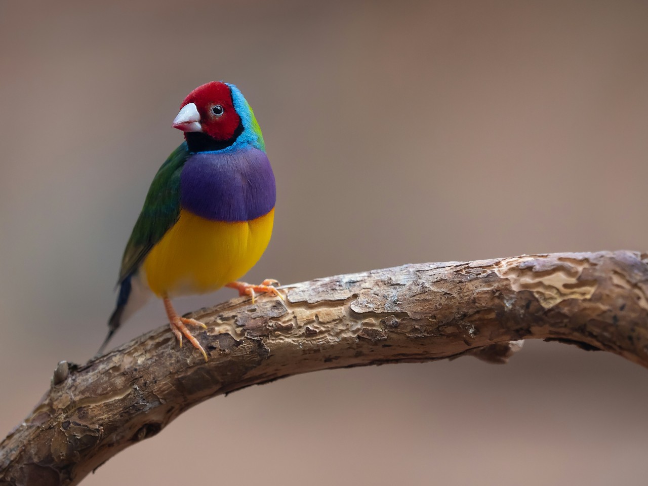
If everything in your painting is bright and saturated, nothing gets to be the star.
Imagine a brightly coloured bird surrounded by equally bright greens, oranges, blues and yellows.
Your eye doesn't know where to look.
Now put that same bird against beautifully muted foliage, branches and background colours.
Suddenly the bird sings.
Those quiet colours give our brighter colours somewhere to shine.
Wildlife art especially is full of these gorgeous muted colours — earthy browns, greyed greens, dusty blues, soft purples and colours that don't really have a name at all.
They may not look exciting sitting in your pastel box, but they can be some of the most useful colours you own.
Be careful not to overwork your pastels
There is, however, a difference between creating a beautiful muted colour and accidentally making mud.
Imagine you put down an orange.
It's not quite right, so you add some blue.
Still not right.
So you add some brown.
Then another orange.
Then another blue.
Then perhaps you blend the whole lot together.
Eventually you have so much pigment sitting on the surface that you've filled the tooth of the paper and you've lost that beautiful freshness pastel can have.
That's when I'd stop.
Rather than reaching for yet another colour, ask yourself:
What is actually wrong with the colour I've got?
Is it:
- too warm?
- too cool?
- too bright?
- too dull?
- too light?
- too dark?
That gives you something specific to correct.
How do I choose a specific colour?
Let's say we're drawing the golden fur of a lion.
Instead of asking:
“What colour is lion fur?”
start by asking:
“What colour family am I looking at?”
Maybe the colour you're looking at is basically orange.
Great. That's our starting point.
Now compare the pastel you've chosen with your reference.
Is your pastel too bright?
Look for a more muted orange.
Too yellow?
Look for something slightly redder.
Too warm?
Try a cooler orange or an earthy brown-orange.
Too dark?
Find the same sort of colour in a lighter value.
Too light?
Move into a darker value.
This is much easier than searching through your pastel box hoping to magically find something called Perfect Lion Fur No. 27.
You're learning to nudge your colour choice in the right direction.
What about shadows?
Complementary colour theory can also help us understand shadows.
If we're working with paint, adding a complementary colour can be a beautiful way of neutralising and darkening a colour without simply adding black.
With pastel, once again, we may approach it differently.
If I'm working on orange fur and moving into a shadow, I might simply choose a cooler, darker, more muted orange or brown rather than automatically layering blue over the orange.
But understanding that relationship between orange and blue helps me recognise why that cooler colour works.
And sometimes I might deliberately introduce little touches of blue, purple or another cool colour into the shadow.
The important thing is not to learn:
“Orange animal = blue shadows.”
Instead, look at your reference.
What colour is actually there?
Shadows are influenced by the light source, reflected light and surrounding colours, so they can contain some surprisingly beautiful colour.
Stop naming colours and start looking
Our brains love labels.
Grass is green.
Sky is blue.
Tree trunks are brown.
Dingoes are orange.
But when we start really observing our references, things get much more interesting.
You might find purple in a shadow.
Blue in brown fur.
Pink around an eye.
Green reflected into grey feathers.
Instead of asking yourself what colour something should be, ask yourself what colour you can actually see.
That's when colour becomes really exciting.
Try this little colour challenge
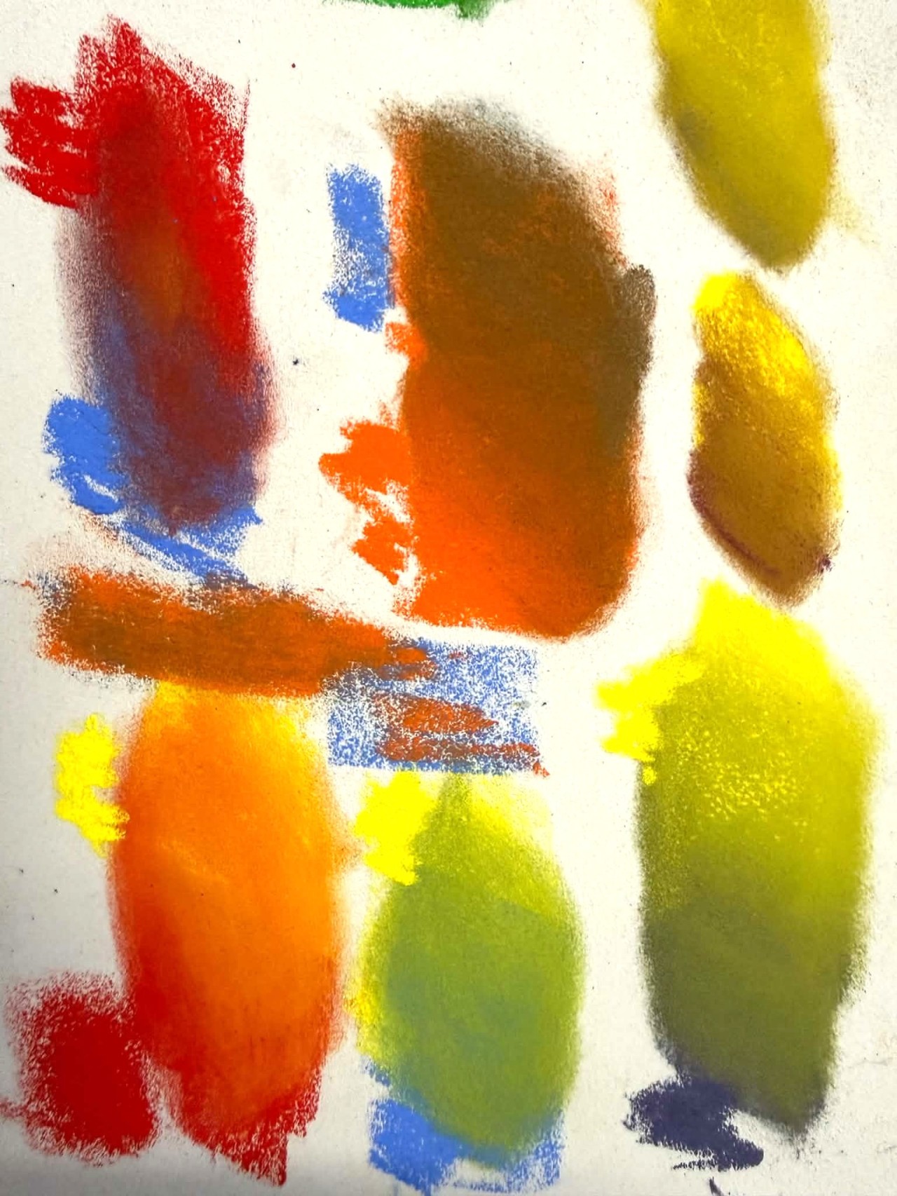
Grab a piece of scrap Pastelmat and some colours from your pastel collection.
Start with a nice bright orange.
Beside it, find a cooler, more muted orange.
Then see what happens when you lightly layer a little blue over your original orange.
Do the same thing with:
Green and Red
Purple and Yellow
Don't worry about creating perfect colours.
You're simply observing what happens.
Then grab one of your wildlife or nature reference photographs and see if you can find some of those muted colours somewhere in the image.
Look in the shadows.
Look in the fur.
Look at tree bark, feathers, rocks and backgrounds.
I think you'll be surprised by just how many supposedly “muddy” colours you can find.
Mud isn't always bad
So the next time you look at a colour and think it's muddy, don't immediately decide you've done something wrong.
Ask yourself:
Did I accidentally overwork this area, or is this simply a muted colour?
Because there's a big difference.
You don't need to memorise the colour wheel, and as pastel artists we don't necessarily need to mix colours the way a painter does.
But understanding why colours behave the way they do helps us make better decisions.
It helps us choose a warmer or cooler pastel.
It helps us recognise when a colour is too saturated.
It helps us understand what colour we might layer over another.
It helps us decide whether we want the quiet harmony of analogous colours or the stronger warm-cool balance of complementary colours.
And most importantly, it helps us stop searching for the perfect pastel and start really looking at the colours in front of us.
Because once you understand how to warm a colour, cool it, neutralise it and adjust its value, the colour wheel suddenly becomes much less mysterious.
And those muddy colours?
You might just find they're some of the most useful colours in your pastel box.